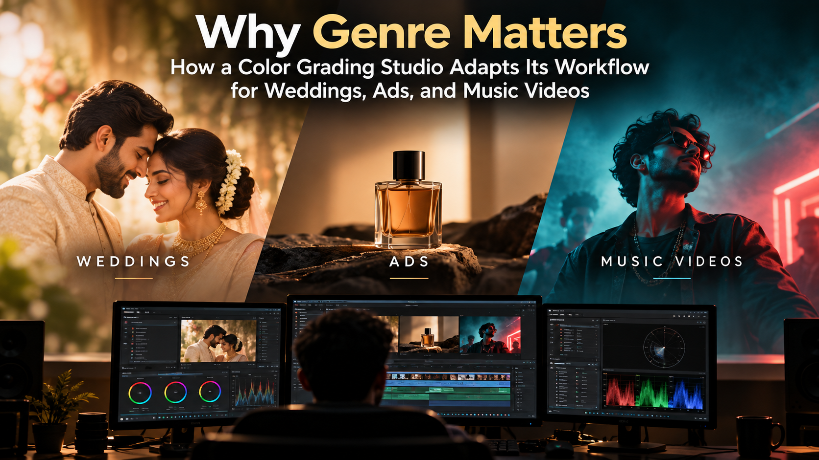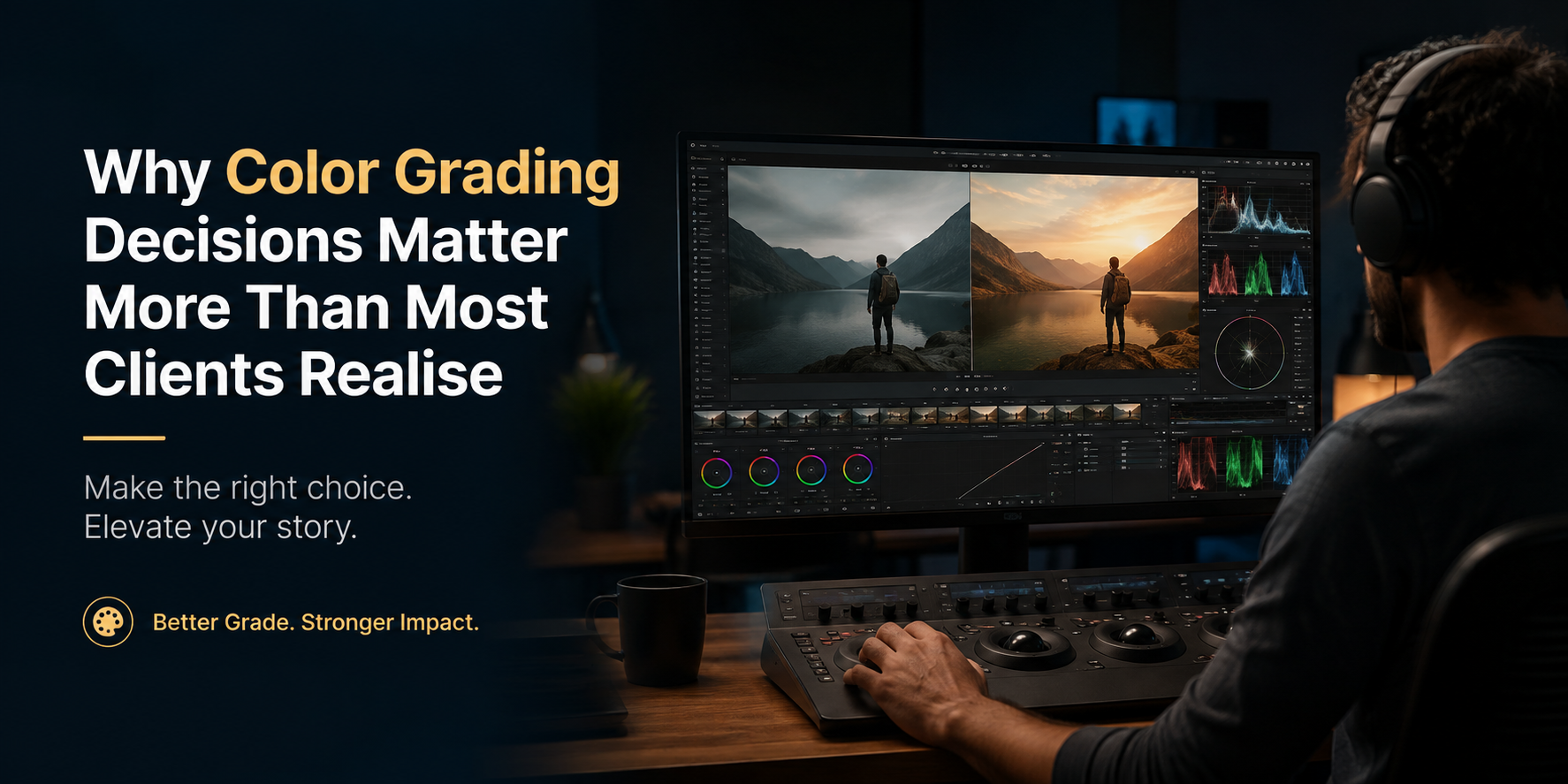

Color Theory for Filmmakers: How Hue, Saturation, and Contrast Shape Mood (and How Color Grading Brings It to Life)
Color grading is the process of adjusting a shot's hue, saturation, and contrast after filming to create a consistent mood and visual style. Filmmakers use color theory not guesswork to decide which colors evoke tension, warmth, isolation, or energy, then apply those decisions in
By Hasna Nambiyarakath
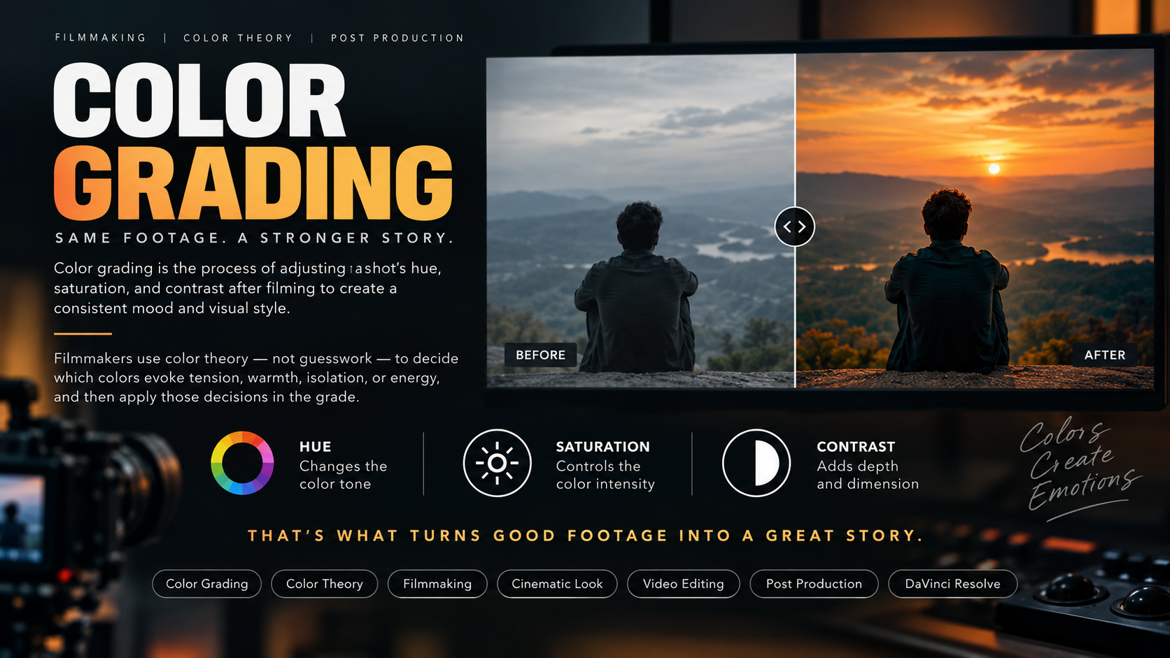
Color grading is the process of adjusting a shot's hue, saturation, and contrast after filming to create a consistent mood and visual style. Filmmakers use color theory not guesswork to decide which colors evoke tension, warmth, isolation, or energy, then apply those decisions in the grade. Mastering this connection between theory and technique is what separates flat, amateur footage from cinematic storytelling.
If you've ever watched a film and felt uneasy before anything happened on screen, color did that. Not the plot. Not the actor's face. The color.
That's the part most new filmmakers skip past. They learn f-stops, frame rates, and lens choices then treat color grading as a five-minute LUT slap at the end. But color isn't decoration. It's a language, and hue, saturation, and contrast are its grammar. If you want your footage to feel intentional instead of just corrected, you need to understand how these three elements work together and how color grading is the tool that executes that vision.
What Is Color Theory in Filmmaking?
Color theory in filmmaking is the deliberate use of hue, saturation, and contrast to guide a viewer's emotional response to a scene. It's the same underlying color science used in painting and design, applied specifically to how light, wardrobe, production design, and post-production grading combine on screen.
Three variables do almost all the work:
Hue - the color itself (red, teal, amber, green)
Saturation - how intense or muted that color appears
Contrast - the range between the darkest and lightest parts of the image
Change any one of these, and the emotional read of a shot changes with it even if nothing else in the frame moves.
Hue: The Emotional Shorthand of Color
Hue is the fastest signal your brain processes in a shot, often before you consciously register what you're looking at. Filmmakers exploit this constantly.
Warm hues (orange, amber, red) read as intimate, nostalgic, or dangerous depending on saturation and context
Cool hues (blue, teal, green) read as isolated, clinical, or melancholic
Complementary pairings most famously orange-and-teal create separation between skin tones and backgrounds while feeling visually balanced, which is part of why that look became a Hollywood staple
This isn't arbitrary. Warm colors have longer wavelengths and are associated evolutionarily with fire and daylight safety and activity. Cool colors are associated with shadow, night, and water stillness and distance. Filmmakers borrow this instinctive response and steer it deliberately.
A practical example: a director might light a family dinner scene in warm tabletop lamp tones to signal comfort, then cut to a cool-toned hospital corridor to signal dread using hue alone to tell the audience how to feel before a single line of dialogue is spoken.
Saturation: Turning the Emotional Volume Up or Down
If hue decides what emotion a color communicates, saturation decides how loud that communication is.
- High saturation feels heightened, stylized, energetic, or artificial think comic-book adaptations or music videos
- Low saturation (desaturation) feels grounded, somber, realistic, or bleak common in war films, prestige dramas, and dystopian settings
- Selective saturation keeping one element vivid while muting everything else draws the eye and can carry symbolic weight (a red object in an otherwise gray world)
Saturation is also where restraint separates professional color grading from amateur work. A common beginner mistake is cranking global saturation to make footage pop, which often just looks oversaturated and artificial rather than intentional. Professional colorists tend to desaturate first, then reintroduce saturation selectively in skin tones, key wardrobe pieces, or focal points rather than boosting everything uniformly.
Contrast: Shaping Depth, Realism, and Tension
Contrast the difference between your shadows and highlights controls how three-dimensional and how emotionally sharp an image feels.
High contrast (deep blacks, bright highlights) creates drama, tension, and a harder, more graphic look associated with thrillers and noir
Low contrast (lifted blacks, muted highlights) creates a softer, dreamier, or more nostalgic feel common in romance and memory sequences
Contrast placement matters too: crushing shadows around a character can isolate them, while an evenly lit, low-contrast frame can suggest safety or normalcy
Contrast also does technical work: it's what makes a subject pop off a background, guides the eye toward a focal point, and gives an image the sense of depth that a flat, contrast-less image lacks.
How These Three Elements Work Together
Hue, saturation, and contrast are rarely adjusted in isolation the mood of a scene comes from how they interact.
A useful way to think about it: hue sets the emotional category, saturation sets the intensity of that emotion, and contrast sets the tension of the image. A cool hue with low saturation and low contrast reads as quiet melancholy. That same cool hue with low saturation but high contrast reads as cold dread. Change one variable, and the entire emotional register shifts even though the base color hasn't moved.
This is exactly why professional colorists don't work with sliders labeled mood. They work with hue, saturation, and contrast and color theory is the map that tells them which combination produces which feeling.
From Theory to Practice: Where Color Grading Comes In
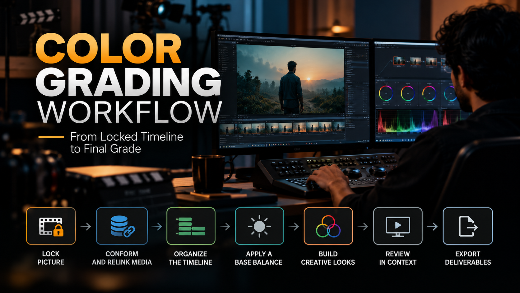
Understanding color theory answers the why. Color grading is the how the technical process of actually applying these decisions to footage using tools like scopes, LUTs, power windows, and secondary color correction.
This is where most self-taught filmmakers hit a wall. They can articulate that a scene should feel colder should feel colder or needs more tension, but translating that into an actual node tree in DaVinci Resolve, or a curve adjustment in Premiere's Lumetri panel, is a different skill entirely. Color grading requires:
- Reading a waveform and vectorscope to make objective, repeatable adjustments rather than eyeballing a monitor that may be miscalibrated
- Building a grade in layers primary correction (exposure, white balance) before secondary correction (selective hue/saturation/contrast adjustments)
- Matching shots across a scene so cuts feel seamless despite different lighting conditions
- Protecting skin tones while pushing everything else toward the target mood
This is a learnable, structured skill not an innate talent which is why a growing number of filmmakers are moving from tutorial-hopping to structured color grading courses that teach the full pipeline in order, rather than isolated tricks.
Common Color Grading Mistakes Rooted in Misunderstood Theory
- Global saturation boosts instead of selective saturation, which makes footage look artificial rather than stylized
- Copy-pasting LUTs designed for different cameras or lighting conditions, which throws off skin tones and contrast balance
- Chasing trends (like orange-and-teal) without understanding why that pairing works, leading to a grade that looks like an imitation rather than a choice
- Over-crushing blacks for a Cinematic look, which destroys shadow detail and can make contrast feel harsh rather than intentional
- Ignoring scene-to-scene consistency, so the emotional throughline of hue and saturation choices breaks down across the edit
- Each of these is a theory problem before it's a technical one. Fixing the software workflow without fixing the underlying color logic just produces a more polished version of the same mistake.
Take Your Color Grading Further
Reading about hue, saturation, and contrast is a solid foundation but color grading is a hands-on craft that's best learned by grading real footage, getting feedback, and building muscle memory with scopes and node trees. If you're ready to move from understanding color theory to confidently grading your own projects, a structured color grading course can take you through the full workflow: primary correction, secondary correction, skin tone protection, and building a consistent look across an entire project the same process used in professional post-production pipelines.
Frequently Asked Questions
What is the difference between color correction and color grading?
Color correction is the technical process of fixing exposure, white balance, and consistency issues across shots so footage looks natural and matches from cut to cut. Color grading happens after correction and is the creative process of applying a stylized look adjusting hue, saturation, and contrast to support the mood and tone of the story.
Why do so many films use orange and teal color grading?
Orange and teal sit opposite each other on the color wheel, so pairing them creates strong visual contrast that separates warm skin tones from cooler backgrounds. This complementary relationship reads as balanced and polished to the eye, which is why it became a popular (and sometimes overused) look in mainstream film and streaming content.
Do I need expensive software to learn color grading?
No. Free and lower-cost tools like DaVinci Resolve (which has a fully capable free version) and Premiere Pro's Lumetri panel support professional-level color grading, including scopes, secondary correction, and node-based workflows. The skill lies in understanding hue, saturation, and contrast theory and applying it with scopes not in the price of the software.
How long does it take to get good at color grading?
Basic color correction skills can be learned in a few weeks of consistent practice, but developing a confident creative eye for color grading reading scopes instinctively and matching shots quickly typically takes several months of hands-on grading, which is why structured courses with guided feedback tend to accelerate progress compared to scattered tutorials.